2026-07-10 · StackFill
Spot Color Preservation in Web-to-Print
Learn where Pantone values get lost in web-to-print workflows and how a PDF-native approach keeps spot channels intact through customer personalization.
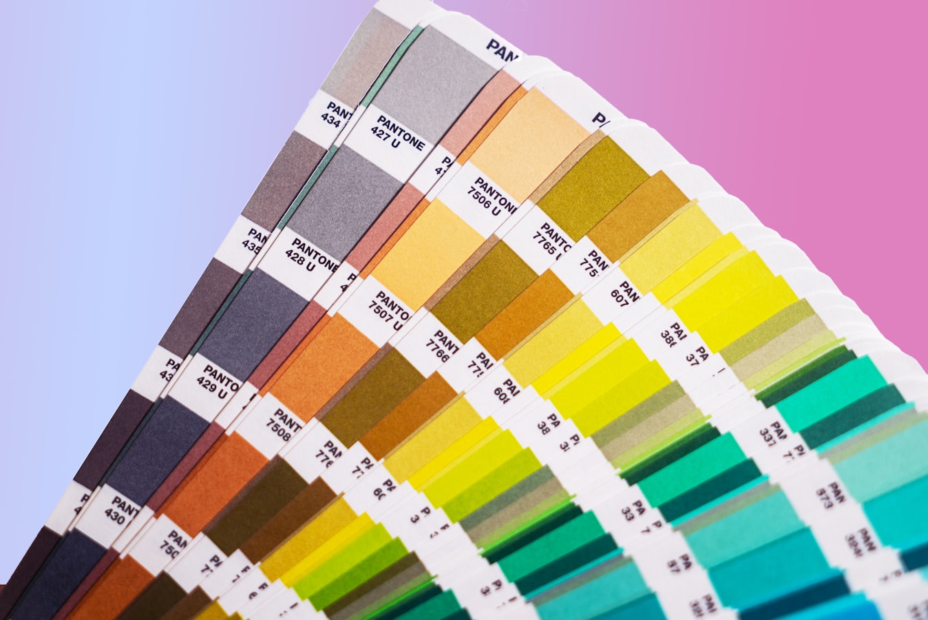
Spot Color Preservation in Web-to-Print: How Pantone Values Survive Personalization
Most print shops treat spot color jobs with care from the first proof to the final press sheet. Then a customer personalizes a file through a web-to-print portal, and that care quietly disappears. The Pantone value that was specified in the original design gets converted, silently, to an RGB or CMYK approximation. Nobody gets a warning. The press operator finds out when the ink doesn't match.
This article explains exactly where that color data gets lost, why it happens so often, and what a PDF-native approach to spot color preservation web to print actually looks like.
What "Spot Color" Actually Means on Press (and Why It's Fragile)
A spot color is a premixed ink. Rather than simulating a color by overprinting cyan, magenta, yellow, and black dots, the press runs a dedicated ink formulated to a specific standard, most commonly Pantone's Matching System. One ink, one channel, one result.
That precision matters when color is load-bearing. A brand's signature blue on a franchise brochure, a safety orange on an equipment label, a metallic gold on a product package, these aren't decorative choices. They're specifications that have to match every time, across every printer, across every geography.
Spot colors are also fragile in digital workflows because they exist as named channels in a PDF. The file doesn't say "this is 100% cyan and 40% magenta." It says "this is Pantone 286 C." When software that doesn't understand named channels opens that file, it converts the channel to whatever color mode it uses internally. Often that's RGB. Sometimes it's a CMYK approximation. Either way, the channel name is gone, and with it the press operator's ability to run the job correctly.
Read more about why process color isn't a substitute in CMYK is not a color mode.
Where Web-to-Print Workflows Kill Pantone Values
The damage usually happens at one of three points.
Template import. Most web-to-print platforms accept a design file, then re-render it inside their own editor engine. That engine works in RGB. The moment the file is parsed for editing, named spot channels are mapped to their screen equivalents and the channel names are discarded.
Personalization rendering. When a customer types a name, swaps a photo, or changes a field, the platform composites the result in its native color space. If that space is RGB or sRGB, every element in the composition takes on that color profile, including the unchanged elements that originated as spot colors.
PDF export. Even if the platform outputs a PDF, the file it produces reflects the color space used during rendering. A file that entered as PDF/X-1a with a Pantone 485 C channel can exit as a standard PDF with a 0/91/87/0 CMYK approximation and no channel name. That file will preflight, but it won't run correctly on a spot color job.
The result is a file that looks right on screen and fails on press. No error message. No preflight flag. Just a color that doesn't match the brand specification.
Why Rebuilding a Template Is the Root of the Problem
The import step is where most of the damage originates, and the import step exists because these platforms require you to recreate your design inside their system before customers can personalize it.
That recreation process is the core problem. You're not just moving a file from one place to another. You're translating it into a different rendering environment, and that environment was not built for press-accurate color. It was built for screen display. Spot channels don't map to pixels on a monitor, so the platform converts them to something that does.
This is what we've called the recreation tax, the cost in time, accuracy, and color fidelity that you pay every time you have to rebuild a finished design in a new system. For process color jobs the tax is annoying. For spot color jobs it can mean reprints.
The only way to avoid the translation problem is to never translate the file in the first place.
How PDF-Native Personalization Keeps Spot Colors Intact
StackFill's approach is to ingest the finished print PDF directly into a structured scene graph without converting its contents. The PDF's color data, including named spot channels, is parsed and preserved as-is. When a customer personalizes an editable field, only the designated editable elements are modified. The locked elements, including any spot color objects, are never re-rendered in a different color space.
When the customer downloads the completed file, StackFill outputs a byte-identical CMYK PDF with the original spot channels still intact. The Pantone value that was in the source file is the Pantone value in the output file. The press operator gets the same channel information they would have gotten from the designer's original.
This also means the live proof the customer approves is rendered from the actual PDF data, not a screen-optimized simulation. What the customer sees is an accurate representation of what will print. That matters for how to let customers edit PDF without changing the design, the proof needs to be trustworthy, especially when the brand standard is a spot color.
For a broader look at how this fits into a PDF/X-1a compliant web-to-print workflow, that article walks through what PDF/X-1a requires and why compliance matters at press time.
What to Check Before You Publish a Personalizable Spot Color File
Before you make a spot color file available for customer personalization, run through this list.
Confirm the spot channels are named correctly in the source PDF. Open the file in Acrobat and check the Output Preview panel. You should see your Pantone channels listed by name alongside CMYK. If you only see CMYK values, the channels were already lost upstream in the design file.
Know which elements use spot color. Backgrounds, logos, and rules are common candidates. If any of those elements are marked as editable in the scene graph, the customer could replace them with process-color content. Lock anything that must stay as a named spot.
Check overprint settings. Spot colors frequently overprint in print-ready files. If an editable element sits on top of a spot color object, confirm that the overprint behavior is preserved in the output PDF. A rendered composite can flatten overprints in ways that change the final appearance.
Run preflight on the output. After you set up the template and generate a test download, preflight the result against a press profile. Verify the spot channel names are present and that no unintended color conversions appear in the report.
Test with edge-case inputs. Have someone enter long text, a high-contrast image, or an unusual character set into every editable field, then download and preflight the result. Edge cases surface rendering problems that a standard test won't catch.
Who Needs Spot Color Preservation Most
Not every job runs spot color. But for the shops and teams that do, the stakes are high.
Corporate and franchise marketing teams are the clearest case. A brand color is a legal and reputational commitment. If a franchise location downloads a personalized flyer with a CMYK approximation of the brand blue instead of the specified Pantone value, the shop that prints it may not catch the error. The result ships wrong. Marketing teams managing brand templates across locations need to know that personalization does not touch the color specification.
Print shops running PMS work, labels, packaging, brand stationery, promotional items, need consistent spot output for customer reorders. If a customer personalizes a reorder and the color data changes in the process, the new run won't match the old one. That's a reprint conversation nobody wants to have.
Agencies managing template portals for multiple clients face the same issue at scale. One client's Pantone spec leaking into another job, or being converted silently on download, is a quality control failure that reflects on the agency. Agencies running multi-client template portals need audit-level confidence that color data is stable across every personalization.
Labels and packaging shops deal with spot colors more than almost any other segment. Regulatory colors, safety warnings, and brand identifiers on packaging are specified to tolerances that CMYK can't reliably hit. PDF-native personalization is the only approach that doesn't introduce a color conversion risk at the customer interaction layer.
Spot color preservation isn't a niche feature. It's the difference between a web-to-print workflow that a press operator can trust and one that requires a manual preflight every single time a customer file comes in.